


A comprehensive art e-learning platform for young art enthusiasts
A comprehensive art e-learning platform for young art enthusiasts
A comprehensive art e-learning platform for young art enthusiasts


User flow
A well designed user flow can help increase conversion rates. By guiding users through the process in a clear and easy-to-understand way, they are more likely to follow through with their intended action.
I designed the path of the users to be as straightforward as possible, eliminating unnecessary steps to help users easily navigate the site and reach their goal.
The checkout flow below is linear to make it easy for users to complete the steps of the checkout process without confusion. A guest checkout is included in this flow, however, I eliminated the guest checkout option when I decided that a paywalled freemium model would work best for ArtScape.

Competitor analysis
As part of my research, I conducted a thorough competitor analysis to evaluate the strengths and weaknesses of other players in the market. By doing so, I was able to identify areas where ArtScape could differentiate itself and provide a unique value proposition to users. This analysis allowed me to gain insights into user expectations and find opportunities to set ArtScape apart from its competitors.
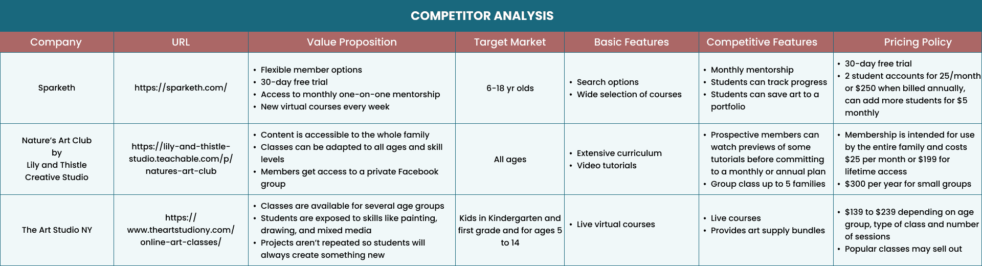
After conducting a thorough competitor analysis, it became clear that Sparketh has a strong value proposition and competitive pricing, as well as a website that excels in usability, content, ease of use, and customer reviews.
Using this information, I was able to identify key opportunities to make ArtScape differentiate itself from competitors - offer a paywall option and gamify the users’ tutorial experience. The paywall option will allow new users to explore the website and experience using the content in a limited space. The paywall system will allow users to view two tutorial videos for free each month if they sign up. They can upgrade to standard or premium subscriptions any time to access all other features the website has to offer.
For future iteration of this project, I would like to develop the gamification features to drive user engagement, for example - incentivizing users with rewards for completing a tutorial video, reading articles or completing quizzes. Gamification will also be used to personalized the user experience - users can track their progress and the website will create personalized recommendations.
ArtScape - A UX Case Study
ArtScape - A UX Case Study
Secondary Research | Branding | Competitor Analysis | Information Architecture | Wireframing | Prototyping | Usability Testing
Secondary Research | Branding | Competitor Analysis | Information Architecture | Wireframing | Prototyping | Usability Testing
Overview
For my second capstone project at Springboard, I collaborated with ArtScape, a fictional e-commerce company, to optimize their website's conversion rate from browsing to checkout completion. The business goal was to enhance the responsive website experience, ultimately increasing ArtScape's revenue.
ArtScape's innovative art tutorial platform is designed to inspire and develop the artistic skills of young art enthusiasts. Through a comprehensive e-learning program, learners can explore the fascinating world of art at their own pace and in their own time. The website offers both subscription-based and freemium services, allowing users to enjoy limited video access before committing to a plan. This project focused on optimizing the website's functionality and user experience, ensuring seamless navigation and an enjoyable learning experience.
The Problem
The Problem
According to data, 50% of users abandon the site without moving items to cart. Additionally, 70% of users who intended to checkout, abandon the cart. The company also wants to capture the users’ email at checkout.
According to data, 50% of users abandon the site without moving items to cart. Additionally, 70% of users who intended to checkout, abandon the cart. The company also wants to capture the users’ email at checkout.
According to data, 50% of users abandon the site without moving items to cart. Additionally, 70% of users who intended to checkout, abandon the cart. The company also wants to capture the users’ email at checkout.
The Solution
The Solution
To avoid abandoned cart, the checkout process was simplified, a variety of payment options was provided, all cost were disclosed upfront, and a clear information about the tutorial service and subscription rates was provided.
To avoid abandoned cart, the checkout process was simplified, a variety of payment options was provided, all cost were disclosed upfront, and a clear information about the tutorial service and subscription rates was provided.
To avoid abandoned cart, the checkout process was simplified, a variety of payment options was provided, all cost were disclosed upfront, and a clear information about the tutorial service and subscription rates was provided.
My Role
My Role
As the solo UX/UI Designer for this project, I conducted secondary research and synthesis, mapped out a user flow, designed wireframes and hi-fi prototypes and conducted usability testing.
As the solo UX/UI Designer for this project, I conducted secondary research and synthesis, mapped out a user flow, designed wireframes and hi-fi prototypes and conducted usability testing.
As the solo UX/UI Designer for this project, I conducted secondary research and synthesis, mapped out a user flow, designed wireframes and hi-fi prototypes and conducted usability testing.
Project Plan
Project Plan
This project plan outlines all of the steps I took to complete this project, as well as the methods, deliverables, and time estimates associated with those steps.
This project plan outlines all of the steps I took to complete this project, as well as the methods, deliverables, and time estimates associated with those steps.

01
01
Research and Analysis
Research and Analysis
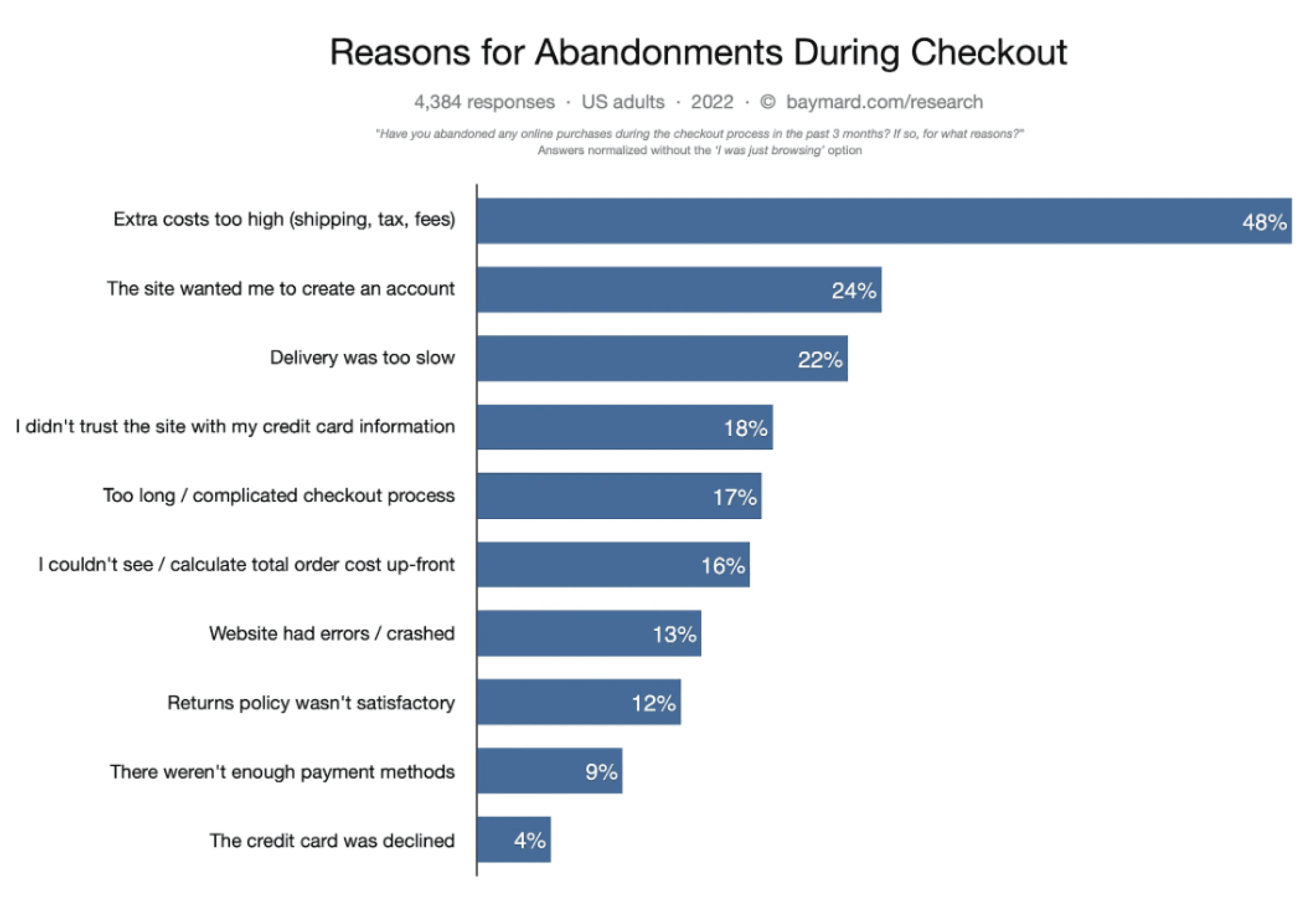
In my secondary research, I delved into the reasons why users tend to abandon e-commerce websites, particularly when it comes to abandoned carts. Additionally, I explored the factors that influence user decisions in tutorial websites, as well as the design considerations that need to be taken into account when creating e-learning platforms for children, both free and paid subscription-based.
My research yielded significant findings, indicating that parents are looking for an e-learning website that is safe, appropriate, and provides quality tutorial content with a broad range of lessons. They are also seeking engaging and interactive activities that are affordable. In contrast, children are interested in a visually appealing website with fun and creative content that allows them to showcase their artwork.
These insights were crucial in guiding my design decisions, ensuring that the final product met the needs of both parents and children, and provided an enjoyable and fulfilling learning experience for all users.
Secondary research
Secondary research
Pain points
Pain points
During the checkout process of e-commerce websites, users often encounter common pain points that can lead to frustration and complaints. These pain points include:
During the checkout process of e-commerce websites, users often encounter common pain points that can lead to frustration and complaints. These pain points include:

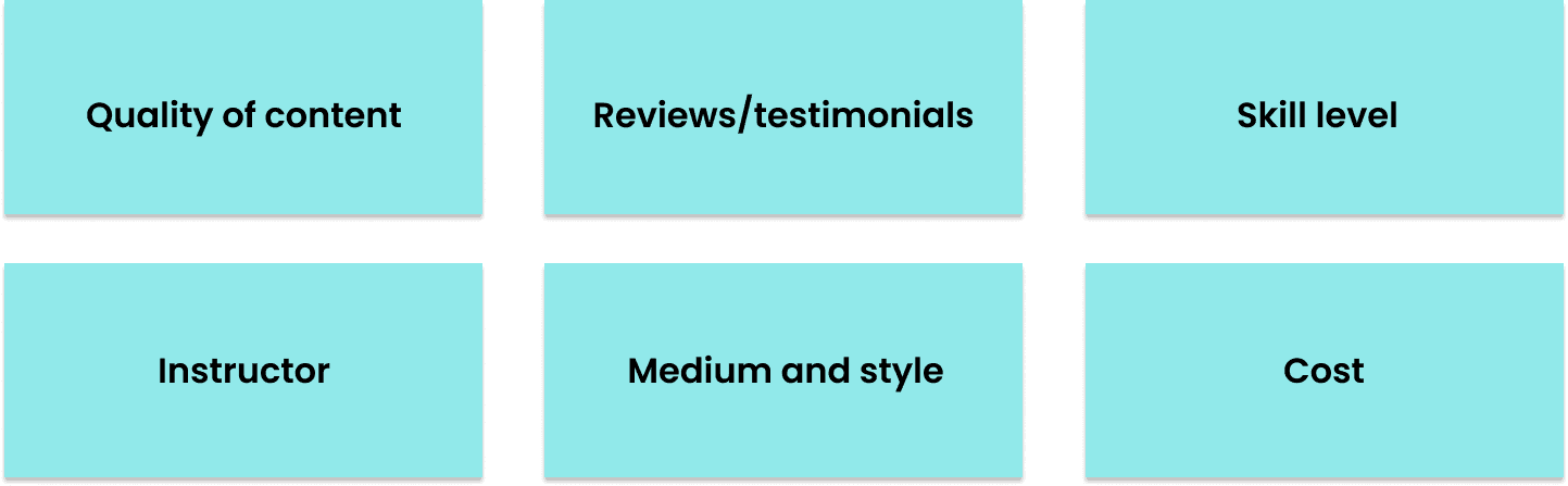
Factors that impact users’ decision-making
Factors that impact users’ decision-making
When deciding whether to subscribe to a paid tutorial website, users take multiple factors into account. The following are some essential considerations that can influence their decision on which tutorial videos to watch:
When deciding whether to subscribe to a paid tutorial website, users take multiple factors into account. The following are some essential considerations that can influence their decision on which tutorial videos to watch:
When deciding whether to subscribe to a paid tutorial website, users take multiple factors into account. The following are some essential considerations that can influence their decision on which tutorial videos to watch:
Factors that impact users’ decision-making
Competitor analysis
As part of my research, I conducted a thorough competitor analysis to evaluate the strengths and weaknesses of other players in the market. By doing so, I was able to identify areas where ArtScape could differentiate itself and provide a unique value proposition to users. This analysis allowed me to gain insights into user expectations and find opportunities to set ArtScape apart from its competitors.
After conducting a thorough competitor analysis, it became clear that Sparketh has a strong value proposition and competitive pricing, as well as a website that excels in usability, content, ease of use, and customer reviews.
Using this information, I was able to identify key opportunities to make ArtScape differentiate itself from competitors - offer a paywall option and gamify the users’ tutorial experience. The paywall option will allow new users to explore the website and experience using the content in a limited space. The paywall system will allow users to view two tutorial videos for free each month if they sign up. They can upgrade to standard or premium subscriptions any time to access all other features the website has to offer.
For future iteration of this project, I would like to develop the gamification features to drive user engagement, for example - incentivizing users with rewards for completing a tutorial video, reading articles or completing quizzes. Gamification will also be used to personalized the user experience - users can track their progress and the website will create personalized recommendations.
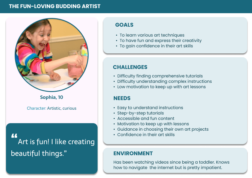
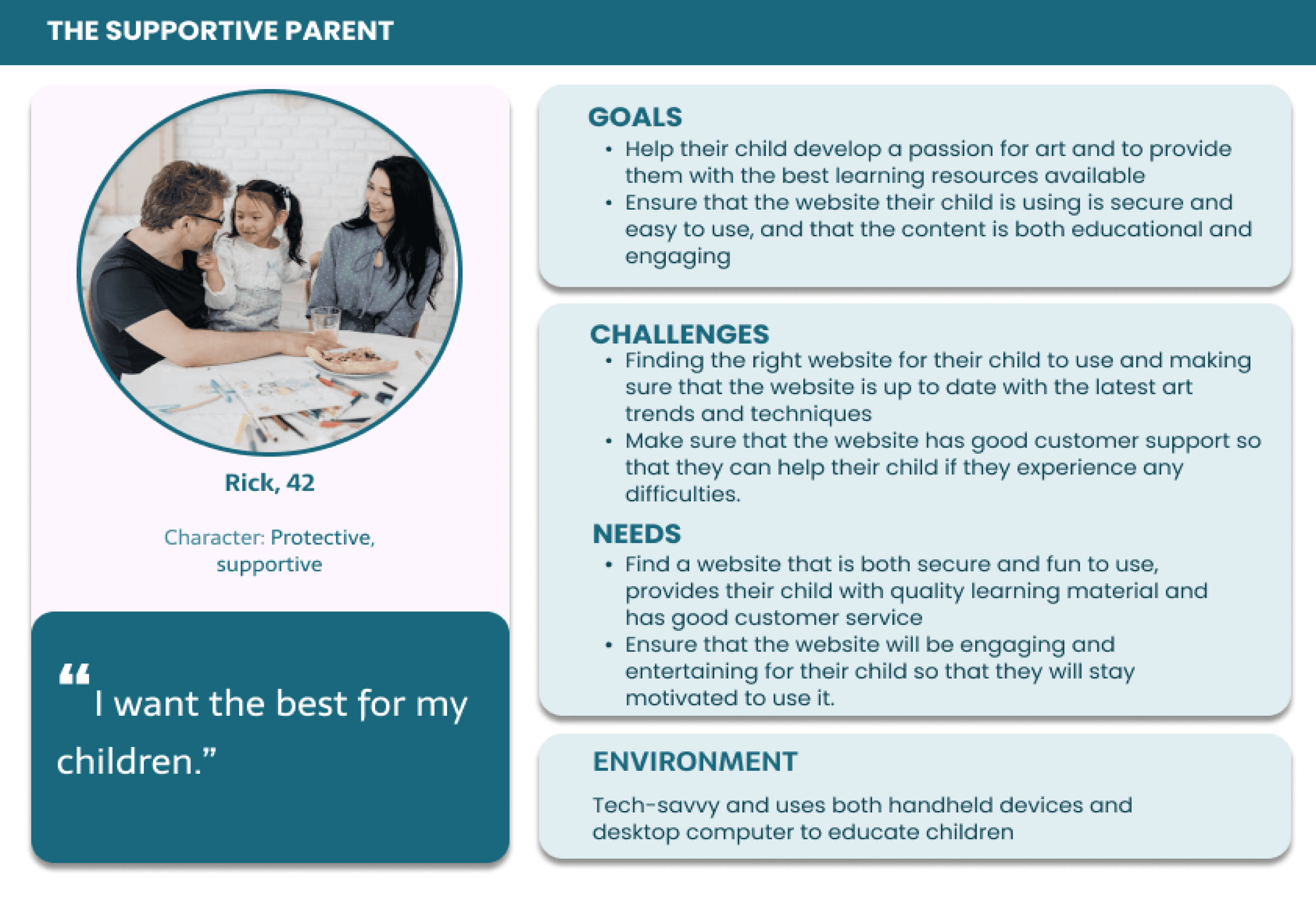
User personas
To create user-centered design, I conducted thorough research on competitor websites and analyzed their website analytics. This research served as the foundation for creating user personas, which helped me understand who I was designing for. With user personas in mind, I could make informed decisions to meet their needs and challenges.
The first persona represents the needs and challenges of parents who are looking for the right art tutorial website for their child/children. The second persona captures the goals and preferences of young users who seek engaging and motivating activities, as well as the opportunity to have fun and gain confidence in their art skills. These user personas provided valuable insights that shaped the design decisions for ArtScape's website.

User flow
A well designed user flow can help increase conversion rates. By guiding users through the process in a clear and easy-to-understand way, they are more likely to follow through with their intended action.
I designed the path of the users to be as straightforward as possible, eliminating unnecessary steps to help users easily navigate the site and reach their goal.
The checkout flow below is linear to make it easy for users to complete the steps of the checkout process without confusion. A guest checkout is included in this flow, however, I eliminated the guest checkout option when I decided that a paywalled freemium model would work best for ArtScape.
User personas
To create user-centered design, I conducted thorough research on competitor websites and analyzed their website analytics. This research served as the foundation for creating user personas, which helped me understand who I was designing for. With user personas in mind, I could make informed decisions to meet their needs and challenges.
The first persona represents the needs and challenges of parents who are looking for the right art tutorial website for their child/children. The second persona captures the goals and preferences of young users who seek engaging and motivating activities, as well as the opportunity to have fun and gain confidence in their art skills. These user personas provided valuable insights that shaped the design decisions for ArtScape's website.
Design and Testing
02
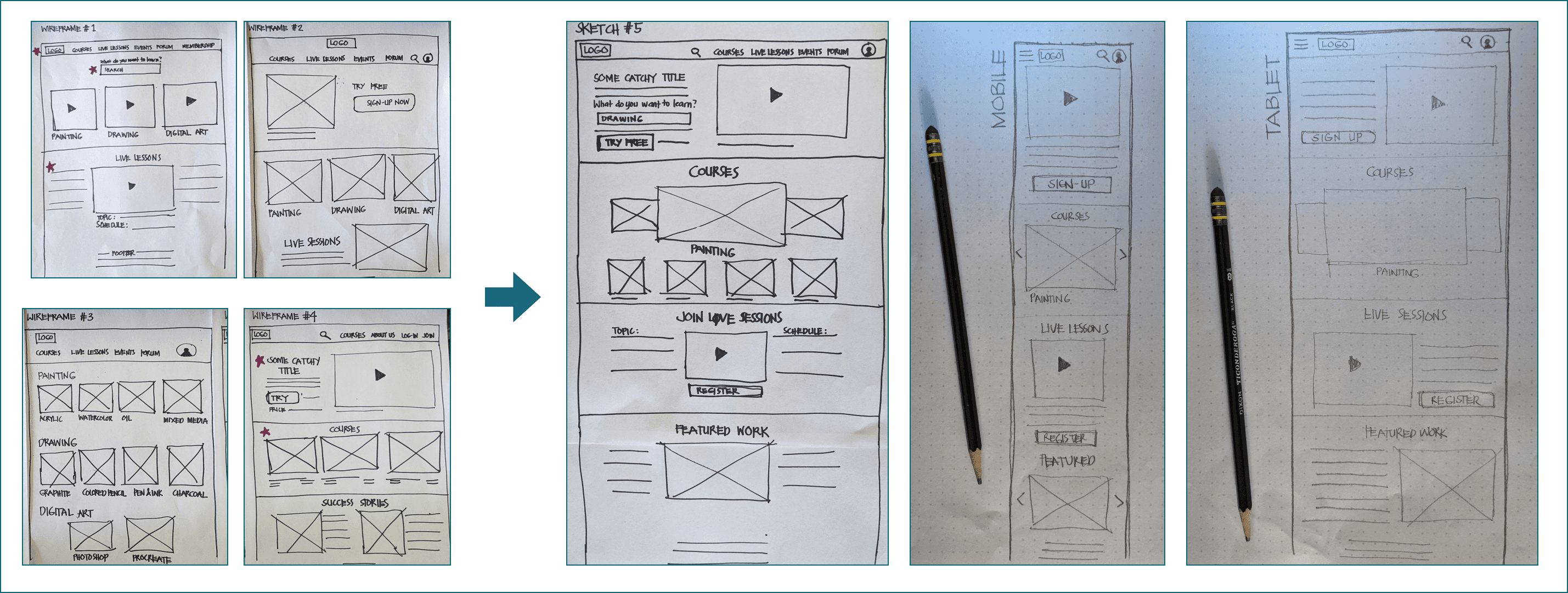
Sketches
To generate solution ideas rapidly, I sketched multiple screen variations and evaluated which features would best fit ArtScape's needs. Additionally, I created sketches of how the design would appear on various screens.
Design and Testing
02
Sketches
To generate solution ideas rapidly, I sketched multiple screen variations and evaluated which features would best fit ArtScape's needs. Additionally, I created sketches of how the design would appear on various screens.
Competitor analysis
As part of my research, I conducted a thorough competitor analysis to evaluate the strengths and weaknesses of other players in the market. By doing so, I was able to identify areas where ArtScape could differentiate itself and provide a unique value proposition to users. This analysis allowed me to gain insights into user expectations and find opportunities to set ArtScape apart from its competitors.
After conducting a thorough competitor analysis, it became clear that Sparketh has a strong value proposition and competitive pricing, as well as a website that excels in usability, content, ease of use, and customer reviews.
Using this information, I was able to identify key opportunities to make ArtScape differentiate itself from competitors - offer a paywall option and gamify the users’ tutorial experience. The paywall option will allow new users to explore the website and experience using the content in a limited space. The paywall system will allow users to view two tutorial videos for free each month if they sign up. They can upgrade to standard or premium subscriptions any time to access all other features the website has to offer.
For future iteration of this project, I would like to develop the gamification features to drive user engagement, for example - incentivizing users with rewards for completing a tutorial video, reading articles or completing quizzes. Gamification will also be used to personalized the user experience - users can track their progress and the website will create personalized recommendations.
Wireframes
To uncover potential issues in the design flow, particularly in the checkout process, I created wireframes and conducted guerrilla testing to identify any flaws.
Wireframes
To uncover potential issues in the design flow, particularly in the checkout process, I created wireframes and conducted guerrilla testing to identify any flaws.

Guerilla testing and insights
After conducting a quick round of guerrilla testing with family and friends and consulting with my mentor, I was able to uncover several major issues, including:
After conducting a quick round of guerrilla testing with family and friends and consulting with my mentor, I was able to uncover several major issues, including:
Guerilla testing and insights
After conducting a quick round of guerrilla testing with family and friends and consulting with my mentor, I was able to uncover several major issues, including:
Checkout can still be simplified
Guest checkout is unnecessary for paywalled websites
Unclear subscription plan options
Checkout can still be simplified
Guest checkout is unnecessary for paywalled websites
Further improvements can be made to clarify the subscription plans
Checkout can still be simplified
The previous flow of purchasing a single tutorial video to own indefinitely before committing to monthly or yearly payments for all the services on the site allowed for a quick and easy checkout process. However, this fell behind the offer of other competitors. After conducting thorough research, I made a major design decision to switch to a paywalled system, which not only simplifies the process for users but also makes it more profitable for ArtScape.
Although guest checkout has been found to reduce cart abandonment, I decided to remove it from the flow as it is not necessary for paywalled websites. Users must create an account to access free content or start a free trial, allowing the company to collect user data for further marketing strategies.
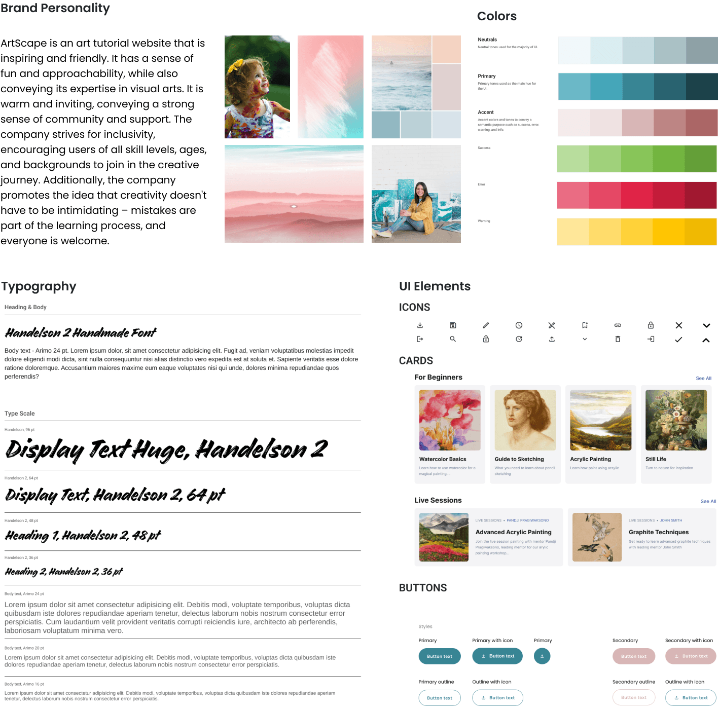
Branding & Style Guide
To establish a consistent and cohesive visual identity for the company, I created a brand personality and style guide from scratch. This involved defining the company's values, tone of voice, typography, color palette, imagery style, and overall design aesthetic. With this guide in place, it ensured that all design work, both online and offline, was aligned with the company's brand identity. This consistency not only helped to reinforce the brand in the minds of customers but also helped to differentiate it from competitors.
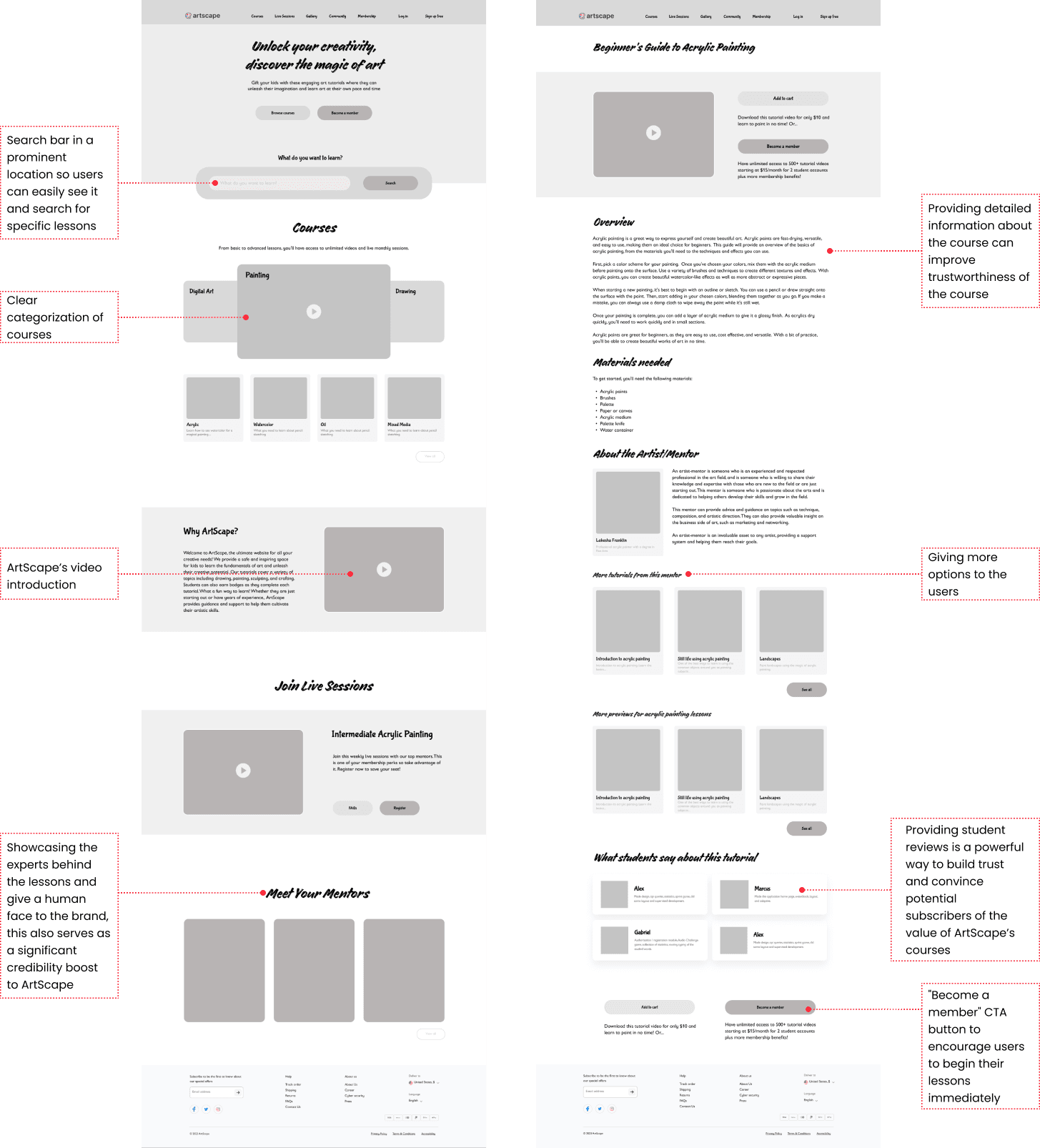
Hi-Fidelity Prototype
Using the research findings, I enhanced the design and created a user-friendly and straightforward checkout flow with a playful and fun visual style, and a paywalled system that caters to the needs of ArtScape's target audience.
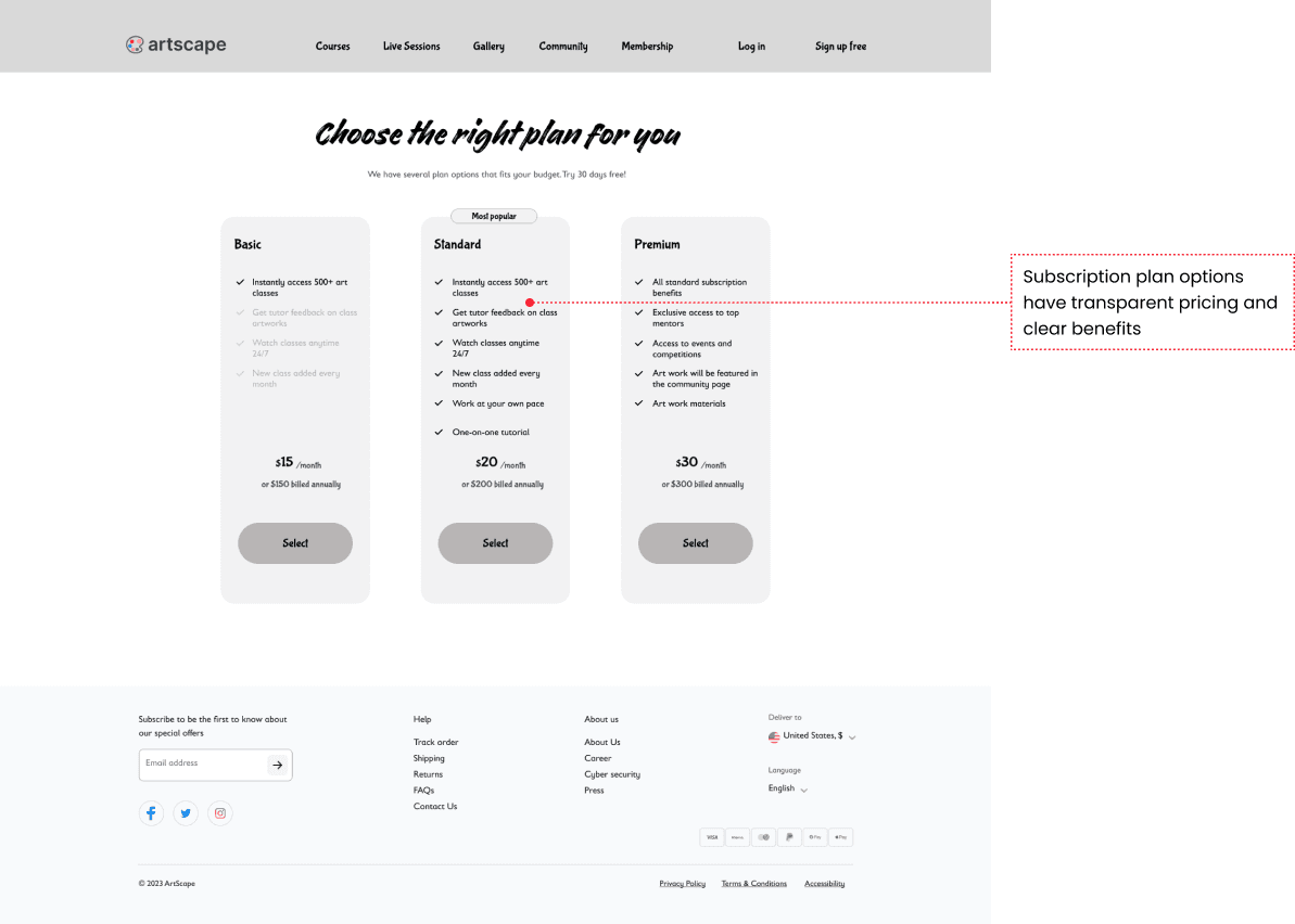
To entice users to sign up for the freemium plan, they will have access to two engaging and interactive tutorial videos per month, complete with step-by-step guidance and clear instructions. The standard subscription features will give users access to all tutorials, monthly mentor feedback, and live sessions, while the premium subscription will offer a one-on-one tutorial for a more comprehensive learning experience. Subscription options were presented in a clear manner, highlighting benefits and pricing.
To increase conversion rates, I added features such as a free trial, discounted first subscription offer, and a loyalty program that rewards users who have subscribed for a longer duration.
For a more engaging experience for both kids and adults, I designed a gamified user profile that provides challenges and motivation to work on their art skills. This feature adds an element of fun to the learning process and encourages users to continue using ArtScape's services.
Hi-Fidelity Prototype
Using the research findings, I enhanced the design and created a user-friendly and straightforward checkout flow with a playful and fun visual style, and a paywalled system that caters to the needs of ArtScape's target audience.
To entice users to sign up for the freemium plan, they will have access to two engaging and interactive tutorial videos per month, complete with step-by-step guidance and clear instructions. The standard subscription features will give users access to all tutorials, monthly mentor feedback, and live sessions, while the premium subscription will offer a one-on-one tutorial for a more comprehensive learning experience. Subscription options were presented in a clear manner, highlighting benefits and pricing.
To increase conversion rates, I added features such as a free trial, discounted first subscription offer, and a loyalty program that rewards users who have subscribed for a longer duration.
For a more engaging experience for both kids and adults, I designed a gamified user profile that provides challenges and motivation to work on their art skills. This feature adds an element of fun to the learning process and encourages users to continue using ArtScape's services.
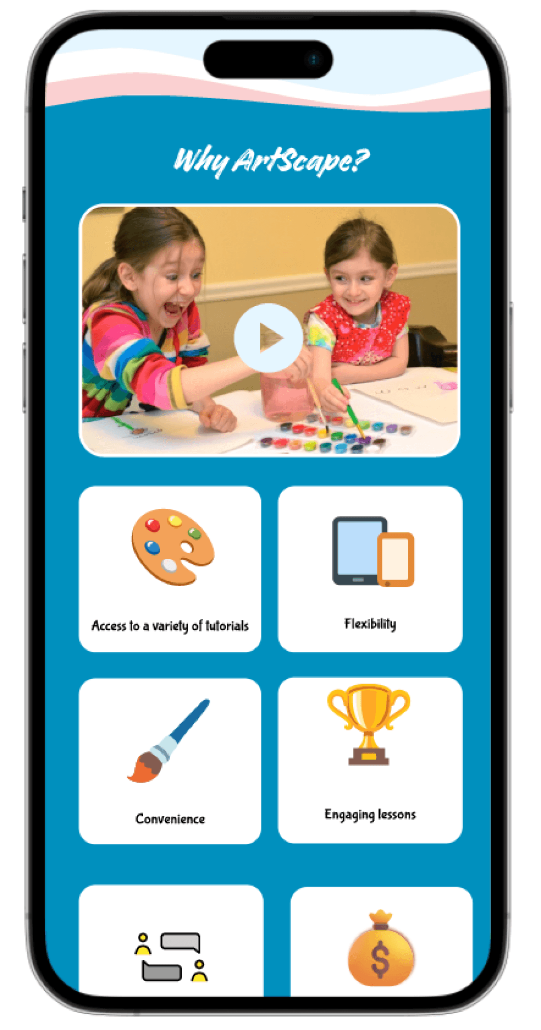
In the tablet prototype, I designed a gamified user profile to make the experience more engaging for young users. The website is designed to be responsive, allowing users to access it from any handheld device and take it with them anywhere they go. This feature not only adds an element of fun to the user experience but also ensures that users can easily pick up where they left off, regardless of the device they are using.
In the tablet prototype, I designed a gamified user profile to make the experience more engaging for young users. The website is designed to be responsive, allowing users to access it from any handheld device and take it with them anywhere they go. This feature not only adds an element of fun to the user experience but also ensures that users can easily pick up where they left off, regardless of the device they are using.
In the tablet prototype, I designed a gamified user profile to make the experience more engaging for young users. The website is designed to be responsive, allowing users to access it from any handheld device and take it with them anywhere they go. This feature not only adds an element of fun to the user experience but also ensures that users can easily pick up where they left off, regardless of the device they are using.
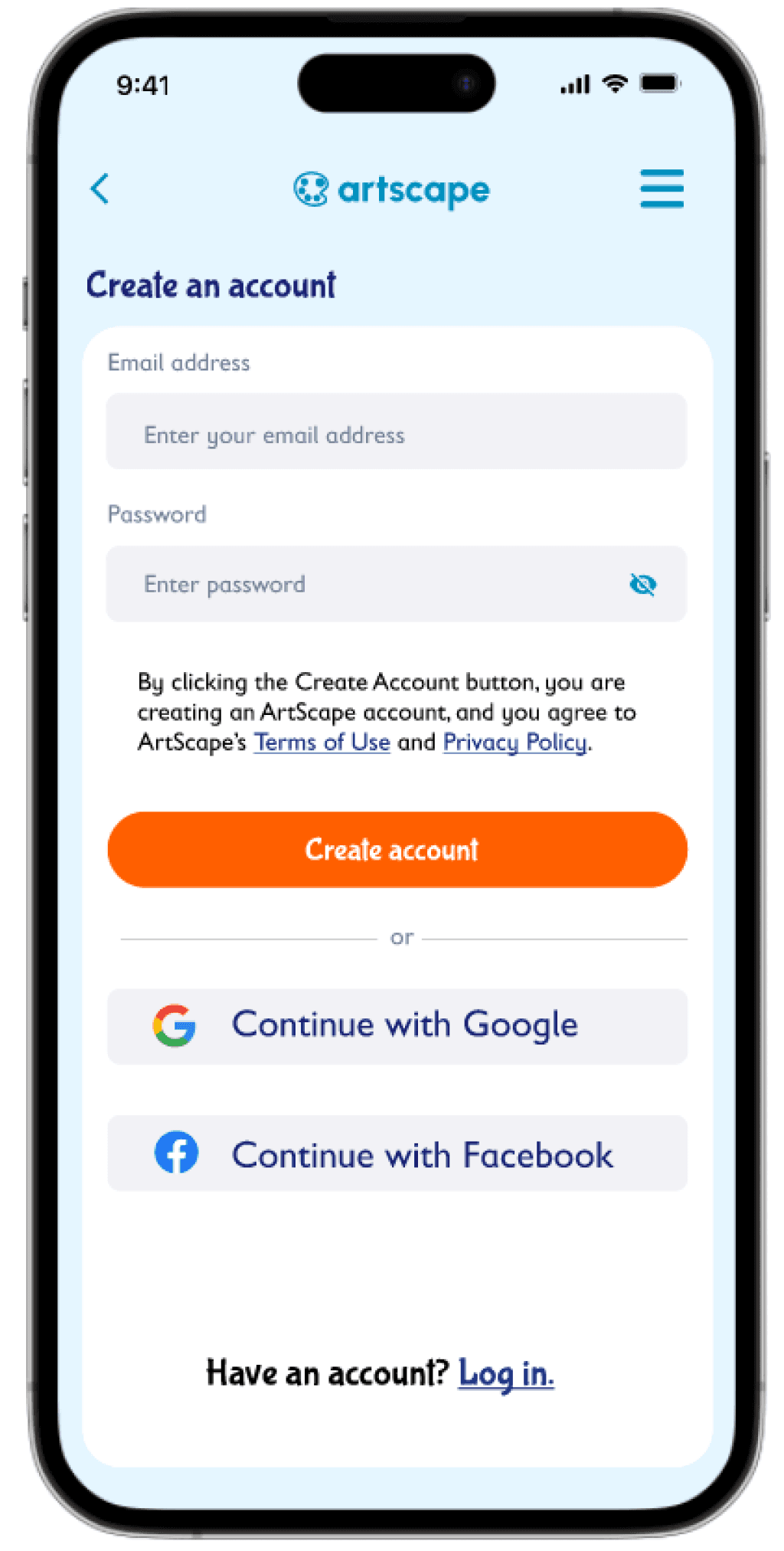
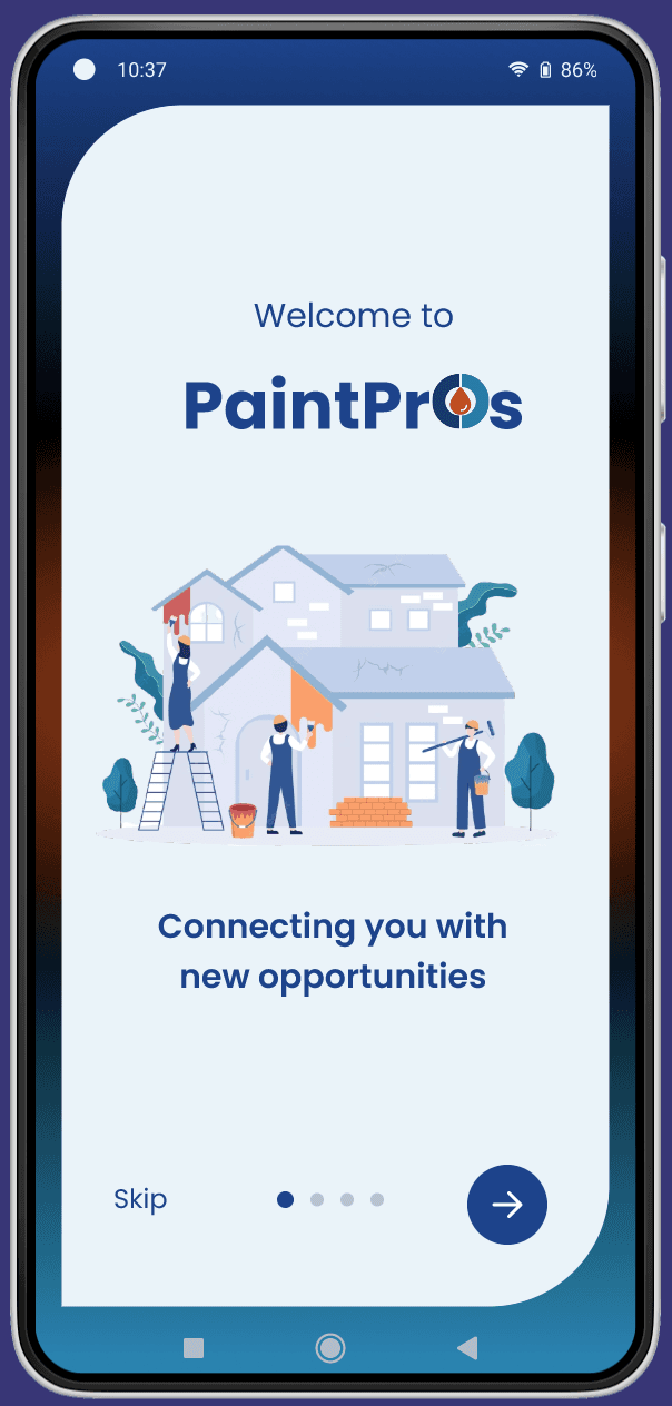
In the mobile prototype below, I demonstrated the user flow for purchasing the standard subscription plan, with a clear and straightforward checkout process. This ensures that users can easily subscribe to the plan of their choice on any handheld device, making the website more accessible and convenient for users on-the-go. The mobile prototype also incorporates a responsive design, optimizing the user experience regardless of the device being used.
In the mobile prototype below, I demonstrated the user flow for purchasing the standard subscription plan, with a clear and straightforward checkout process. This ensures that users can easily subscribe to the plan of their choice on any handheld device, making the website more accessible and convenient for users on-the-go. The mobile prototype also incorporates a responsive design, optimizing the user experience regardless of the device being used.
In the mobile prototype below, I demonstrated the user flow for purchasing the standard subscription plan, with a clear and straightforward checkout process. This ensures that users can easily subscribe to the plan of their choice on any handheld device, making the website more accessible and convenient for users on-the-go. The mobile prototype also incorporates a responsive design, optimizing the user experience regardless of the device being used.


Usability test insights - 2nd round
I conducted remote usability tests and uncovered the following insights: Users found the website easy to navigate, and children enjoyed the colors and the gamified profile. They appreciated the fact that they could view tutorials on any device. The design and functionality of the website made it an enjoyable platform for children to learn and improve their skills. Users also found the free trial offer to be appealing, and the paywall system was well-received.
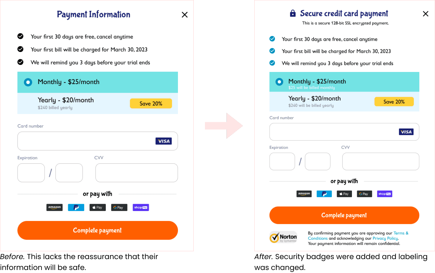
While the remote usability tests showed positive feedback on the website's design and functionality, there are still some areas that need improvement. One major issue is that users want to feel more secure during the checkout process. Adding security badges and trust signals can help alleviate this concern and make users feel more comfortable entering their personal and payment information.
Another area for improvement is providing more comprehensive reviews of the website as a whole, not just for specific video tutorials. This can increase trust and credibility with potential users, especially those who are new to the platform.
In addition, adding more categories for sorting videos can enhance the user experience and make it easier for users to find the content they are looking for. Providing more information on the thumbnail, such as a brief description or a preview of the video, can also help users determine if it is relevant to their interests and needs.
Overall, addressing these issues can further improve the user experience and make ArtScape a more trusted and enjoyable platform for learning and improving art skills.
Usability test insights
- 2nd round
I conducted remote usability tests and uncovered the following insights: Users found the website easy to navigate, and children enjoyed the colors and the gamified profile. They appreciated the fact that they could view tutorials on any device. The design and functionality of the website made it an enjoyable platform for children to learn and improve their skills. Users also found the free trial offer to be appealing, and the paywall system was well-received.
While the remote usability tests showed positive feedback on the website's design and functionality, there are still some areas that need improvement. One major issue is that users want to feel more secure during the checkout process. Adding security badges and trust signals can help alleviate this concern and make users feel more comfortable entering their personal and payment information.
Another area for improvement is providing more comprehensive reviews of the website as a whole, not just for specific video tutorials. This can increase trust and credibility with potential users, especially those who are new to the platform.
In addition, adding more categories for sorting videos can enhance the user experience and make it easier for users to find the content they are looking for. Providing more information on the thumbnail, such as a brief description or a preview of the video, can also help users determine if it is relevant to their interests and needs.
Overall, addressing these issues can further improve the user experience and make ArtScape a more trusted and enjoyable platform for learning and improving art skills.
Iteration
To further enhance the checkout process and make it feel secure, I implemented several measures. Firstly, I added a security badge from a reputable third-party security provider such as Norton, which would increase customer confidence and trust in the website's security measures. This badge would indicate that the website has undergone rigorous security testing and is regularly monitored for any potential security breaches.
Additionally, I included a link to a Privacy Policy that outlined how customer information would be handled and protected. This information would provide customers with a clear understanding of how their personal information would be used and would help reassure them that their privacy was a top priority.
To further improve the user experience, I added a section for general website reviews, in addition to reviews for specific video tutorials. This would provide users with a broader perspective on the website's overall performance and reputation, which can help build trust and increase the likelihood of users becoming paying customers.
I also expanded the categories for sorting videos to provide users with more options for finding the content they need. Lastly, I added more information to the video thumbnail, including the length of the tutorial, the skill level required, and the tools and materials needed to complete the tutorial. This would help users quickly assess whether the video is suitable for their needs and skill level.
Details were added to the tutorial thumbnails to help users make an informed decision in choosing a tutorial video to watch. The duration, star rating and ‘popular’ badge were added to make the card more informative.
Details were added to the tutorial thumbnails to help users make an informed decision in choosing a tutorial video to watch. The duration, star rating and ‘popular’ badge were added to make the card more informative.

This testimonial section will be added in the homepage. Reviews are a powerful tool to increase conversion of paid users as they establish credibility of the site.
This testimonial section will be added in the homepage. Reviews are a powerful tool to increase conversion of paid users as they establish credibility of the site.
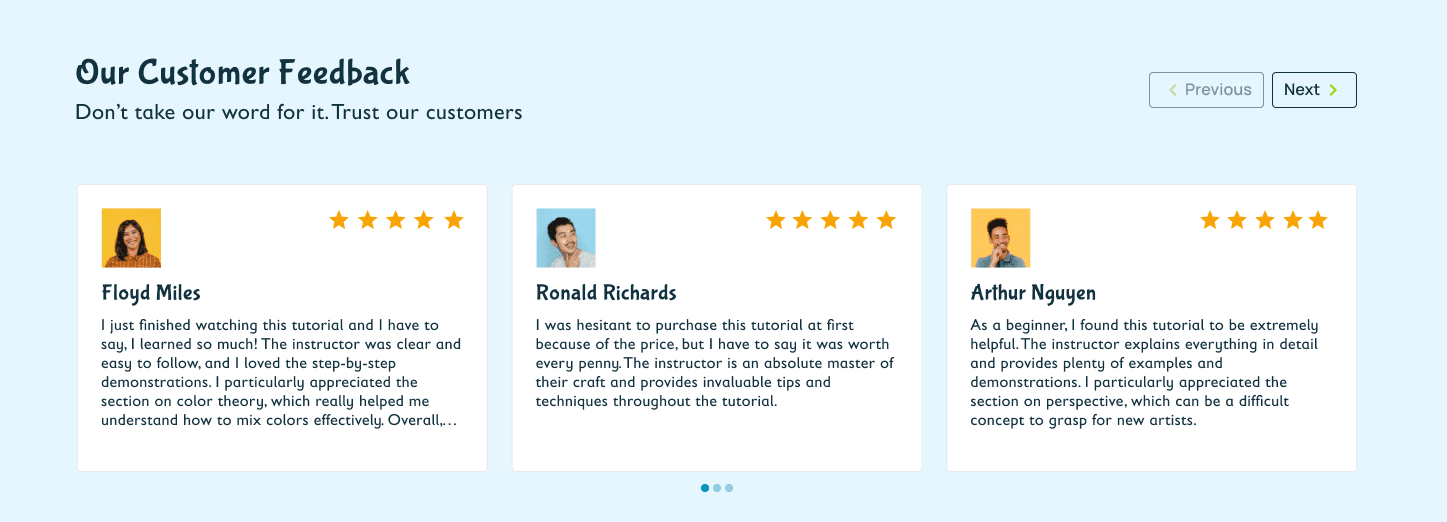
This testimonial section will be added in the homepage. Reviews are a powerful tool to increase conversion of paid users as they establish credibility of the site.
Takeaways
03
03
Takeaways
My key takeaway from this design challenge is the importance of being adaptable and open to making significant changes to improve the user experience. I initially believed that a guest checkout was the best approach for converting users to paying customers, but after conducting research and testing, I realized that a paywalled system with a free trial was the better option for this particular website.
I also learned the value of thoroughly researching and understanding user needs and behaviors. By gathering insights from user testing and incorporating them into the design, I was able to create an experience that was enjoyable and engaging for both kids and adults.
In UX design, every detail should be justified by its potential to enhance the user experience. I now understand that creating a good user experience can have a significant impact on business revenue, as satisfied customers are more likely to become loyal customers and recommend the product or service to others.
Overall, I have learned that flexibility, research, and a focus on user needs are crucial components of successful UX design.
Moving forward
Moving forward
Moving forward
Based on the insights I gained from usability testing, there are several areas I plan to explore in future iterations to further enhance the user experience. One area I want to focus on is the checkout process in a paywalled system. I would like to experiment with additional features, such as a discounted first subscription offer and a loyalty program that rewards users who have subscribed for a longer duration.
Additionally, I will consider adding the option for users to cast their screens to a TV to improve the viewing experience.
Overall, I believe that implementing these improvements will help make the user experience even better, which will ultimately lead to increased business revenue.
Thank you!
Thank you!
Other case studies
Other case studies
Other case studies
Design and Testing
02
Details were added to the tutorial thumbnails to help users make an informed decision in choosing a tutorial video to watch. The duration, star rating and ‘popular’ badge were added to make the card more informative.
During the checkout process of e-commerce websites, users often encounter common pain points that can lead to frustration and complaints. These pain points include:
Pain points
Kala's Marketplace Management Portal
A B2B & B2C PaaS solution that empowers marketplace operators the ability to offer local product sales

Kala's Marketplace Management Portal
A B2B & B2C PaaS solution that empowers marketplace operators the ability to offer local product sales
Kala's Marketplace Management Portal
A B2B & B2C PaaS solution that empowers marketplace operators the ability to offer local product sales